As we near the middle of the decade, digital design is changing fast. Neumorphism is a big trend now. It makes things look soft and touchable.
This style mixes looks with use, making things easy to use and nice to look at. It uses soft UI and visual design to make things better. Neumorphism is leading the way in UI/UX trends for 2025.
This design makes things easy for users and looks modern. It fits well with today’s style.
Key Takeaways
- Neumorphism combines aesthetics and functionality in digital design.
- Soft UI principles enhance user engagement and interface appeal.
- Visual design elements promise to evolve significantly in upcoming years.
- Growing UI/UX trends prioritize user-friendly experiences.
- Emphasis on modern, sleek styling remains integral to design choices.
The Rise of Neumorphism in Design
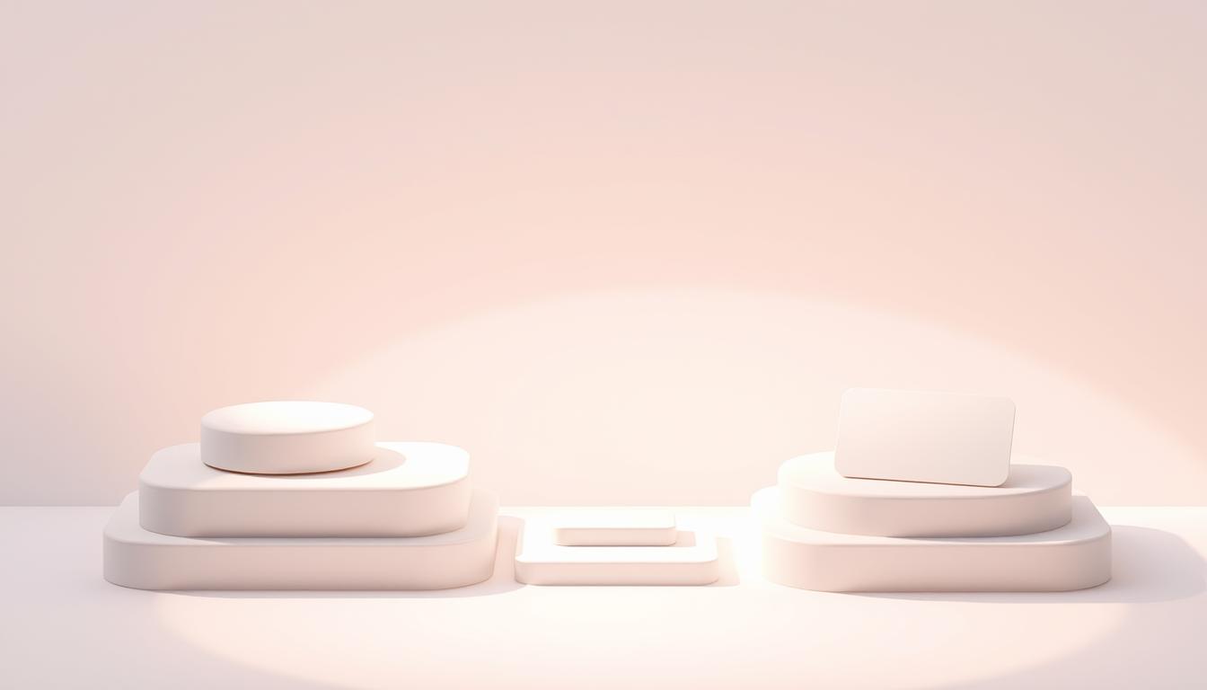
Neumorphism is a new trend in design. It mixes soft and subtle elements in a unique way. This makes interfaces look both deep and touchable.
It came as a response to trends like minimalism and flat design. Neumorphism brings a fresh look to modern UI.
The history of neumorphism is about making user experiences better. Designers wanted to make things more interesting without being too much. Now, we see interfaces that are not only pretty but also fun to use.
Many brands are using neumorphism to connect with their audience. It makes visuals more engaging and interactions smoother. Designers use soft shadows and highlights to make users want to explore.
Understanding Soft UI and Its Impact
Soft UI is a big step in visual design. It’s linked to neumorphic UI. It uses soft shadows, blurred backgrounds, and rounded edges.
This makes interfaces feel natural and welcoming. Designers use these features to make things more comfortable for users.
Soft UI brings a unique look to digital design. Soft shadows make things look like they’re floating. This makes users want to interact more.
Many websites and apps use soft UI for better usability. Rounded edges and subtle colors make things look good and easy to use. This makes users feel connected to what they’re using.
As design keeps changing, soft UI stays important. It helps shape the future of neumorphic UI. Designers use it to make things look great and work well.
| Feature | Soft UI | Traditional UI |
|---|---|---|
| Shadows | Soft, diffused | Sharp, defined |
| Backgrounds | Blurred and gradient | Solid colors |
| Edges | Rounded | Square |
| User Engagement | High, inviting interfaces | Moderate, traditional layout |
Neumorphism Design Trends: Key Characteristics
Neumorphism design trends offer a new way to design. They use special features that make them stand out. This style gives a 3D look with layering and depth, making things look elegant and easy to use.
Layering and Depth in Visual Design
Layering is key in neumorphism. It makes things look deep and layered. This lets users see different levels in the design.
Designers use layering to make things pop. Buttons and cards seem to jump off the screen. This makes users want to interact more.
Subtle Shadows and Highlights
Shadows and highlights add a lot to neumorphism. They make things look soft and inviting. Light shadows make things look happy, while soft highlights make them look real.
Together, these effects make designs look great. They match what people like today.
Comparing Neumorphism with Material Design
Neumorphism and material design are two different ways to design user interfaces. They both aim to make things look good and work well. But they do it in very different ways.
Knowing how they differ helps designers make better digital products. This way, they can make things that are fun and easy to use.
Core Principles and Differences
Material design, started by Google, makes things feel real. It uses depth, layers, and shadows to look like the real world. It also uses bright colors and moving parts to make things feel interactive.
Neumorphism, on the other hand, is softer and simpler. It uses gentle shadows to make flat things look 3D. But it keeps things simple and calm.
Fusion of Styles: Neumorphism and Minimalist Design
When you mix neumorphism with minimalist design, you get something special. Minimalist design is all about being simple and easy to use. It uses few colors and focuses on what’s important.
Adding neumorphism’s soft shadows makes things look good without being too busy. This way, you get a design that’s both pretty and easy to use.
| Aspect | Material Design | Neumorphism |
|---|---|---|
| Visual Depth | Uses layers and shadows to show depth. | Uses soft shadows for a gentle 3D look. |
| Color Palette | Uses bright colors with primary and accent tones. | Uses softer colors, often in one color. |
| User Interaction | Makes things feel real with feedback and animations. | Offers a calm interaction experience. |
| Overall Aesthetic | Dynamic and vibrant, like the real world. | Soft, simple, and inviting, blending simplicity and depth. |
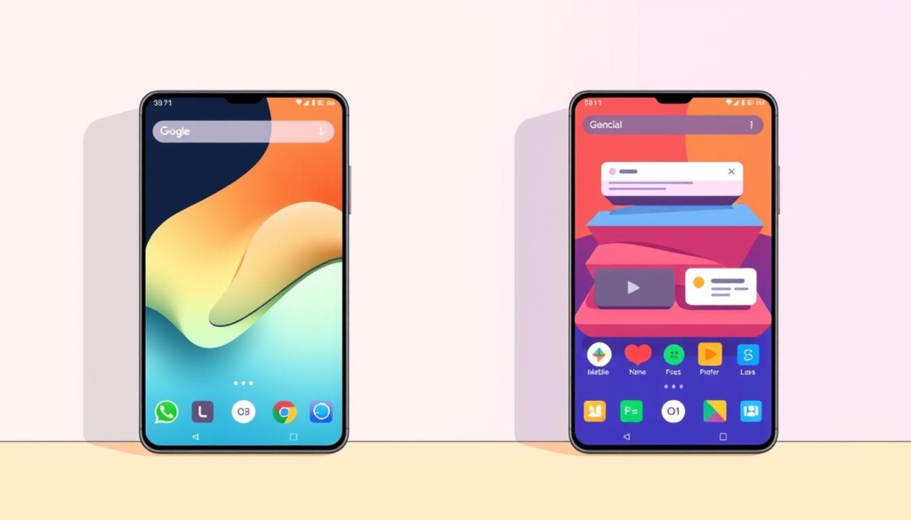
UI/UX Trends Influenced by Neumorphic Aesthetics
Neumorphic UI has made a big splash in digital design. It brings unique visuals that fit right into our screens. This new style is all about making interfaces feel real and fun to use.
Neumorphic design puts people first. It uses soft touches and depth to make tech feel warm and friendly. This makes us feel like we’re really connecting with the tech, not just using it.
Neumorphic style is popping up everywhere. Buttons look like they’re floating, inviting us to click. Navigation is smooth and easy, making everything feel connected.
| Aspect | Neumorphic UI | Flat Design |
|---|---|---|
| Visual Depth | Soft shadows create an illusion of depth | No depth, strictly two-dimensional elements |
| User Engagement | Inviting, tactile interactions | Minimal interaction cues |
| Emotional Connection | Creates warmth and familiarity | Can feel cold and distant |
| Implementation Complexity | More intricate design process | Streamlined and straightforward |
Neumorphism is changing how we design digital stuff. It’s making our screens more welcoming and fun. Designers are now making tech that really speaks to us, making our interactions more meaningful.
Elevating User Experience with 3D Design
Adding 3D design to neumorphism makes things more fun. It brings depth to the soft look of neumorphism. This makes the design more interesting for users.
To make it work well, designers need to be careful. They must keep it clear and easy to use.
Implementing 3D Elements Seamlessly
Adding 3D to neumorphism makes it more interactive. Here are some tips to mix them well:
- Maintain consistency in shadows and highlights to reinforce the three-dimensional effect.
- Use subtle animations that make things more fun when you click on them.
- Keep only the most important parts to make it easy to use.
Balancing Dimension and Usability
It’s important to balance the look and how easy it is to use. Think about these things:
- Check if the 3D parts don’t get in the way of what you need to do.
- Try different looks to find the best one that works well.
- Ask people what they think to make it better and easier to use.
Challenges and Critiques of Neumorphism
Neumorphic design looks great but has big challenges. Designers need to know these issues to make things both pretty and useful. The design’s unique features can make it hard to use and access.
Accessibility Considerations
Accessibility is a big worry with neumorphic design. The soft shadows and colors can be hard for people with vision problems. It’s important to make sure things are clear and easy to see.
Making designs more accessible helps everyone use them better.
Usability Concerns
Usability is also a big issue. The design’s focus on depth and layers can confuse users. This happens when it’s hard to tell what you can click on.
Testing with users and listening to their feedback is key. This way, designs can be better for everyone.
Future Aesthetic Trends Beyond Neumorphism
Designers and users are looking ahead to new trends. The design world is changing, moving past neumorphism. We’re expecting new styles that mix looks and function.
Understanding what users want is key. It helps us guess what new designs will be like.
Emerging Styles for 2025 and Beyond
In 2025, digital spaces will be more personal and fun. AR and VR will change how we see things. Designers will make things more interactive.
Some new styles include:
- Maximalism: It’s all about bold colors and lots of patterns.
- Dark Mode Aesthetics: It’s sleek and easy on the eyes.
- Biophilic Design: It brings nature into digital spaces, making them calm.
Potential Shifts in User Preferences
Users want things that feel just right for them. Designers are making things that really get us. This is changing what we see in the future.
- Designs will be more for everyone, including those with special needs.
- AI will make things more personal, changing based on what we like.
- Designs will change based on how we feel and what’s happening around us.
The future of design is exciting. It will mix looks and function in new ways. This will make our digital world more beautiful and useful.
Conclusion
Neumorphism has changed the way we see design. It brings a new look to UI/UX. Its key features like layering and soft shadows make things feel real.
These design trends show how tech can make things look good and work well. They attract users and make things easier to use.
The future of design will keep using neumorphism’s ideas. Designers will mix new ideas with what users like. This could lead to even better digital experiences.
Designers need to stay flexible and try new things. Neumorphism can change how we interact with things. By using it, designers can lead the next big design changes.
FAQ
What is neumorphism in design?
Neumorphism is a design trend. It looks soft and 3D. It mixes flat design with a touchy feel.
It uses shadows and highlights to show depth. This makes digital things look layered.
How does neumorphism differ from material design?
Neumorphism and material design both add depth. But neumorphism is softer and simpler. It has softer edges and looks lighter.
Material design is about real textures and deeper looks. It feels more physical.
What are the advantages of using neumorphic UI?
Neumorphic UI is easy to use and looks modern. It makes things feel deep and layered. This helps users move around easily and feel comfortable.
Are there any accessibility concerns with neumorphism?
Yes, neumorphism might be hard for some to see. The shadows and highlights might not stand out enough. This could confuse people with vision problems.
Designers need to make sure their designs are clear and easy to use for everyone.
How can I effectively incorporate 3D design elements with neumorphism?
To add 3D to neumorphism, keep it easy to use. Make sure interactive parts are clear and simple. Test your design with real people to make sure it works well.
What are the current trends related to neumorphism?
Trends now include more emotional design and easy-to-use interfaces. There’s a big push for simple looks. Designers aim to make experiences that touch users deeply.
How is neumorphism evolving as we approach 2025?
Neumorphism will get more interactive and personal by 2025. New styles will come out. They might want more interaction but still keep neumorphism’s core ideas.

