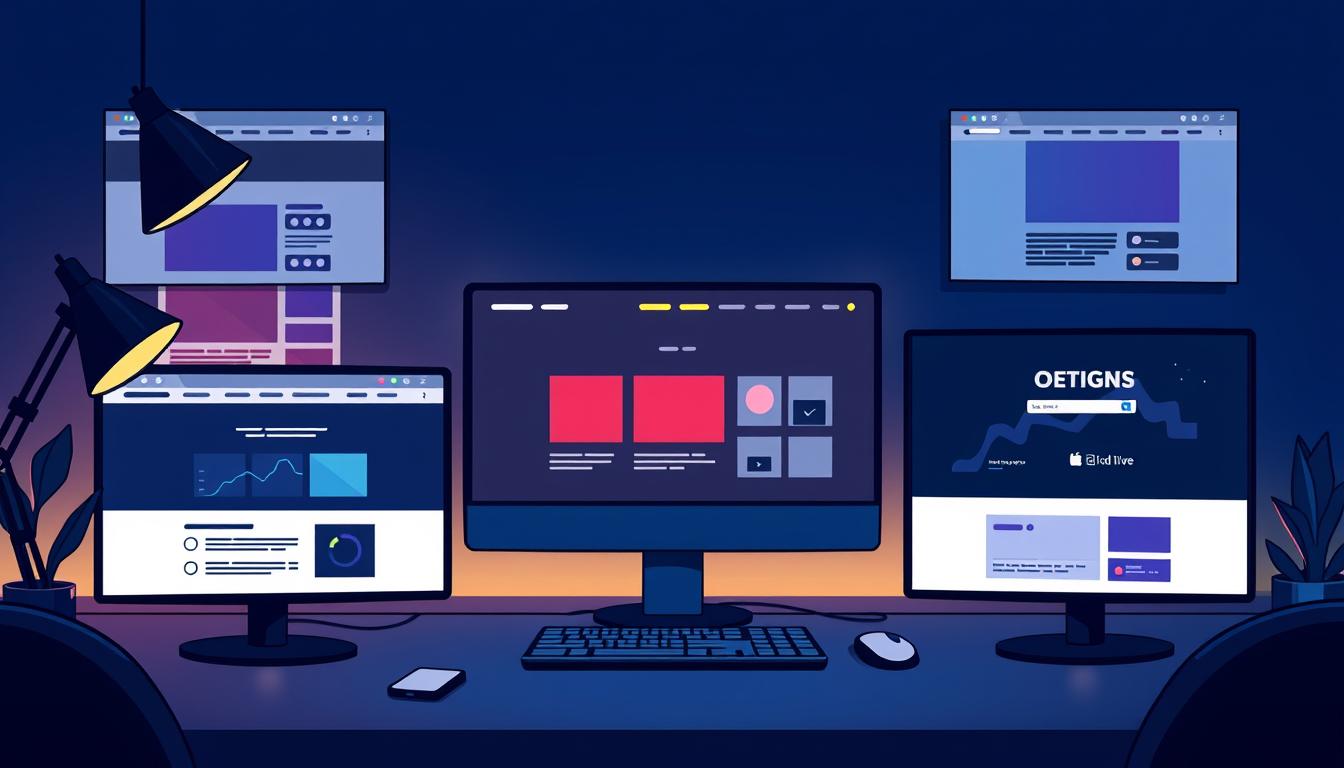
Dark mode has become a key part of web design today. It’s not just a style anymore. It helps users see better in low light and saves battery life on OLED screens.
This article will show you the best ways to use dark mode. We’ll look at how to make your website look good and work well for everyone. Let’s explore how to make your website great in this new design world.
Key Takeaways
- Dark mode is becoming a standard feature in modern web design.
- It aids in reducing eye strain during low-light conditions.
- Battery life improvements on OLED screens are noteworthy benefits.
- Accessibility features are crucial in dark mode implementations.
- Understanding user preferences can refine design choices.
Introduction to Dark Mode
Dark mode is now a key feature in digital platforms. It meets the growing need for a low-light interface. It started in software and became popular in Android and iOS.
It makes things look better and works well. People like it because it’s easy on the eyes in dim places. It makes using devices more fun.
Dark mode makes things stand out more on dark screens. Websites and apps with dark mode offer a cozy look. This fits with the trend of choosing darker themes.
It’s not just for fun. Dark mode is also for work. It shows how design is changing to meet user needs.
Dark mode changes how we use technology. It shows a big shift in how we interact with devices. Looking into dark mode helps us understand its role in making things better for users.
Understanding Dark Mode in Modern Design
Dark mode in digital interfaces is a big change in modern design principles. It makes things look better and changes how we use them. It’s important to make sure it’s easy to use too.
A good dark mode design makes things easier to read. This is because of a good color choice and how things are arranged. This makes the design look nice and work well.
Colors that stand out help guide the user’s eye. For example, bright colors can pop against a dark background. This makes things clearer and more fun to use.
This focus on the user is what dark mode design trends are all about. It makes sure designs are easy to follow and use.
To show how dark mode affects users, here’s a table:
| Design Feature | Impact on User Experience |
|---|---|
| Balanced Color Palette | Improves legibility and reduces eye strain in low light. |
| Visual Hierarchy | Guides user attention to important content. |
| Accented Elements | Enhances interaction with key buttons and calls-to-action. |
| Simplicity in Design | Reduces cognitive load, making navigation intuitive. |
Dark mode is a key part of modern design. It makes things look good and work better. A well-done dark theme grabs attention and shows a brand’s style. It’s a must-have in today’s digital world.
Dark Mode Design Trends
Dark mode design trends are very popular now. They make things look sleek and modern. People like dark themes because they help their eyes and make things clearer.
As dark mode gets more common, it’s key to know how to use it well. This means understanding its different uses and how to add it to your designs.
Advantages of Adopting Dark Themes
Dark mode is not just pretty. It has many good points too. Here are some:
- Reduced Eye Strain: Dark themes cut down on blue light, making it easier on your eyes.
- Improved Battery Life: On OLED screens, dark themes save battery life.
- Enhanced Focus: Dark backgrounds help you focus better by cutting down on distractions.
Common Usage Scenarios for Dark Mode
Dark mode works well in certain situations. Here are some examples:
- Gaming Applications: Gamers like dark interfaces because they make the game feel more real.
- Media Consumption Platforms: Streaming services and video apps look good with dark themes, especially for watching movies and videos.
- Creative Design Tools: Designers often use dark mode in their software to stay focused.
User Experience Enhancements through Night Mode UI
Using a night mode UI makes things better for users, especially in the dark. It helps people who use apps late at night or in dim places. This makes things easier to see and less hard on the eyes.
Designers focus on making things easy to use. This makes users want to stay longer. Important parts of a good night mode include:
- Font selection: Pick fonts that are clear against dark backgrounds to avoid eye strain.
- Optimized touch targets: Make sure buttons and interactive parts are big and far apart for easy use.
- Element contrast: Things need to stand out, using colors that make the night mode better.
Pay close attention to night mode details for better user happiness and keeping them around. Users will like apps that fit their needs, making them happy with the app. As more people want apps for the dark, making these changes is key for good web design.
Creating Accessible Low-Light Interfaces
Designing interfaces for low light needs focus on making them for everyone. It’s important to make sure all users can use dark mode well. Adding accessibility features helps meet rules and makes things better for users.
It’s all about making things visible and comfortable for everyone. This includes people with different sight abilities.
Designing for Accessibility: Key Considerations
Creating accessible low-light interfaces involves several important steps. First, following the Web Content Accessibility Guidelines (WCAG) is key. These guidelines suggest using enough color contrast between text and backgrounds.
Having a high contrast ratio helps users with sight problems see better. Also, choosing the right font sizes makes text easy to read on different devices. Getting feedback from users helps make the design better for everyone.
Color Contrast and Readability Best Practices
Color contrast is crucial for reading in low light. Good design means picking the right colors for text and backgrounds. Dark backgrounds with light text work well together.
Testing these color combinations with real people shows how well they work. Regular checks make sure the design is truly accessible for everyone in low light.
High-Contrast Layouts: Aesthetic and Functional Choices
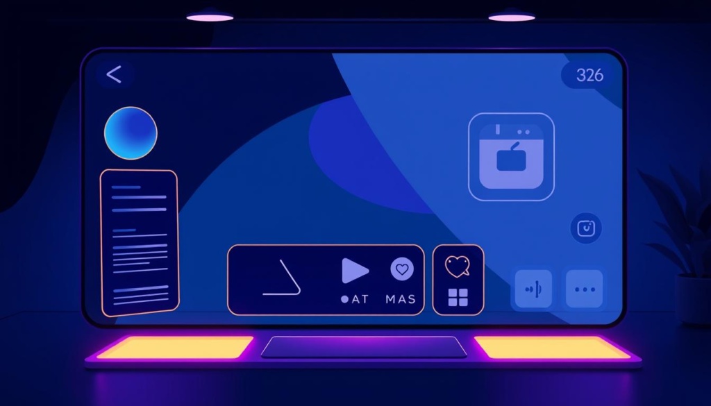
High-contrast layouts in dark mode designs are both beautiful and useful. They use bold colors to make things stand out. This makes them a hit in today’s design world.
Brands like Spotify and YouTube use these layouts to grab users’ attention. The colors help make things easier to read. Good design choices make things easier to use and keep users interested.
| Brand | Design Element | Effect on Usability |
|---|---|---|
| Spotify | Bold Black and Green Palette | Enhanced navigation and visibility of audio controls |
| YouTube | Bright Red Accents on Dark Background | Increased user focus on video content |
| Dark Mode with White Text | Improved readability and reduced eye strain | |
| Netflix | Dynamic Color Contrast for Thumbnails | Guide user attention to featured content |
High-contrast layouts make things look good and work better. They are key in modern design. Using these styles helps make interfaces that people love.
Energy-Saving Displays: Benefits for Users
Dark mode is popular for its looks and practical benefits. It saves energy, especially on OLED devices. This means phones, tablets, and laptops last longer on battery.
Patterns of User Behavior with Dark Mode
People like dark mode for many reasons. Studies show they use it at night or in dim places. It helps their eyes and makes reading easier.
The table below shows how dark mode affects energy use and user habits:
| User Environment | Energy Consumption | Dark Mode Benefits |
|---|---|---|
| Low Light | Reduced | Less eye strain, longer battery life |
| Bright Light | Increased | Enhanced visibility with lower contrast |
| Mixed Environments | Variable | Tailored experience to user needs |
OLED Optimization for Dark Mode Designs
OLED screens are special because they can show true black. This makes things look better and use less energy. It’s important for developers to use this to make things more fun for users.
When making things for OLED screens, focus on what they do best. Here are some tips:
- Use bright colors to make the screen pop.
- Use gradient backgrounds for deep contrast.
- Make sure fonts are easy to read to avoid eye strain.
Websites should also have high-contrast visuals for better reading. This makes things easier to use and looks good too. Text and other parts of the site should be clear and easy to see.
| Characteristic | OLED Display | LCD Display |
|---|---|---|
| Brightness | High contrast with true blacks | Limited contrast ratios |
| Color Accuracy | Vivid colors | Faded colors |
| Energy Efficiency | More efficient with dark mode | Increased power consumption |
By focusing on OLED for dark mode, developers can make things that are both beautiful and fun. This makes for a better experience for everyone.
Minimalist Aesthetics in Dark Mode Implementation
Dark mode makes things look better and makes users more engaged. It’s all about clear content. A simple design helps users focus on what’s important.
Balancing Simplicity and Functionality
Designing simply means thinking about simplicity vs functionality. It’s about keeping things clean but still useful. This makes it easy for users to find what they need.
Many apps show how simple designs work well. Twitter and Spotify are great examples. They use dark mode to make things easy to see and look good.
| Aspect | Minimalist Aesthetics | Functionality |
|---|---|---|
| Clarity | High, due to reduced elements | High, ensures easy understanding |
| User Focus | Maximized with fewer distractions | Maintained with intuitive design |
| Navigation | Simplified through streamlined layouts | Efficient with clear pathways |
| Visual Appeal | Elegant, fostering a pleasant experience | Functional, ensuring task achievement |
In short, dark mode with simple design is better. It keeps things easy to use and fun to look at. This makes digital products more enjoyable for everyone.
Conclusion
The dark mode has changed web design a lot. It mixes what users like with new ideas. This makes websites better for everyone.
Designers now make sites that look good and work well. They think about what users need. This makes websites better for everyone.
Dark mode is not just a trend. It’s a big change in design. It makes sites simple but still useful.
Designers and developers should keep up with these changes. This makes dark mode a common feature. It makes websites better for users.
As technology gets better, we need to keep up. We should focus on making websites easy to use. This will make web design bright, even in dark times.
FAQ
What are the key benefits of using dark mode design trends?
Dark mode design trends have many benefits. They reduce eye strain in dim places. They also help save battery life on OLED screens. Plus, they make it easier to focus on what you’re seeing.
How does dark mode impact user experience enhancements?
Dark mode makes viewing easier in dim places. It lets users enjoy content more without bright backgrounds getting in the way. This makes users happier and keeps them engaged longer.
What should designers consider when creating low-light interfaces?
Designers should focus on making things easy to see in the dark. Use high contrast colors and big fonts. Following WCAG guidelines helps make sure everyone can use it.
Can dark mode help with energy savings?
Yes, dark mode saves energy, especially on OLED screens. These screens use less power when they’re dark. This means your phone lasts longer when it’s dark.
How does minimalist aesthetics enhance dark mode implementation?
Minimalist design in dark mode makes things clearer. It helps users focus better. A simple design makes it easier to use and enjoy.
What are some common scenarios where dark mode is preferred?
Dark mode is great for gaming, watching videos, and designing. It reduces glare and makes things easier to see. This makes the experience better.
How can high-contrast layouts benefit dark mode designs?
High-contrast designs make things stand out. They look good and work well. Using bold colors in dark mode makes things pop and keeps users interested.
What are some best practices for color contrast and readability in dark mode?
Use light text on dark backgrounds for best visibility. Make sure contrast meets accessibility standards. Choose colors that are easy on the eyes to avoid getting tired.

